Gallery


Overview
A slow, desktop-centric website isn't just a technical flaw—it's a silent leak in your revenue funnel.
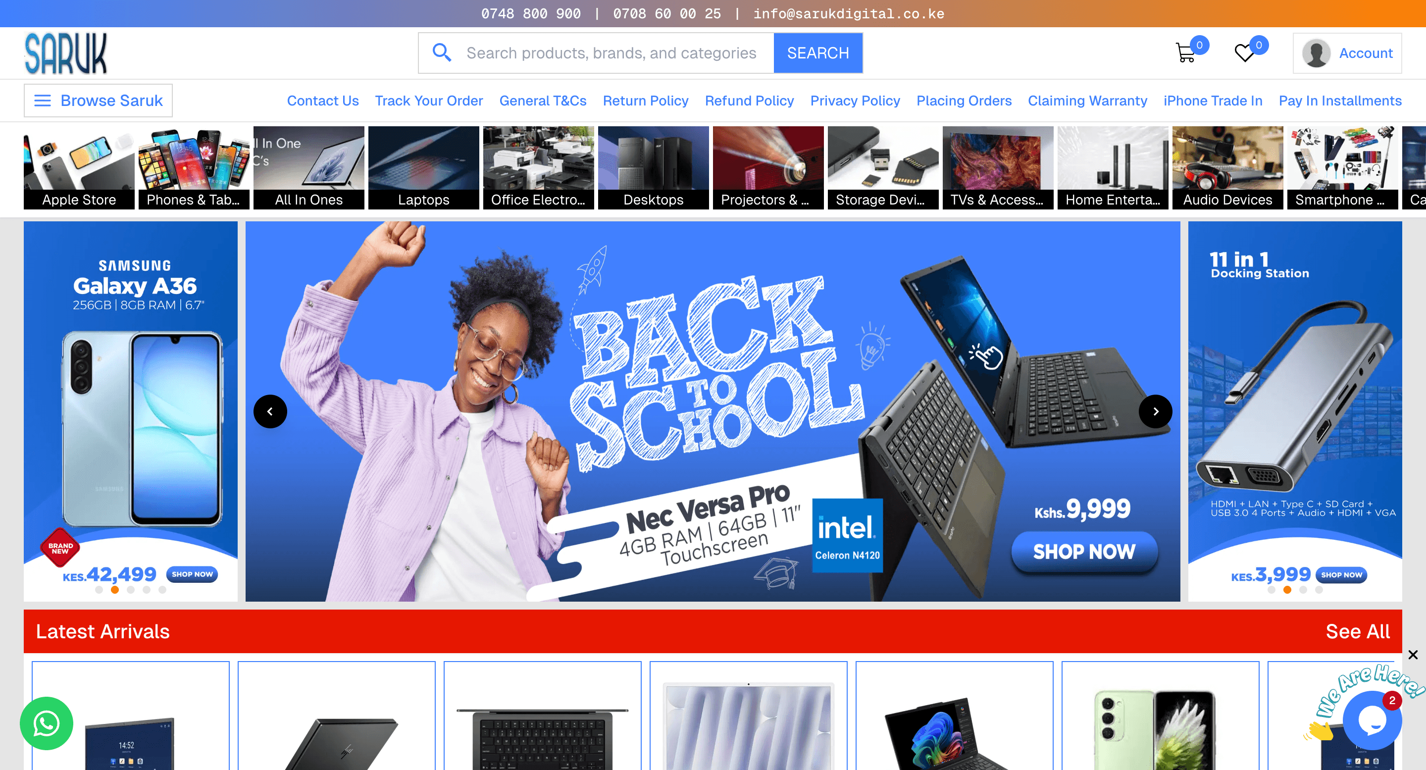
When Saruk Digital Solutions approached us, their site was a relic of a desktop-only era: slow, unresponsive, and visually outdated. It wasn't just a technical flaw—it was a barrier between their products and their customers. We set out to replace that friction with a seamless, mobile-optimized experience that loads in a blink and looks as premium as the brand itself.
With page loads averaging 6+ seconds, the website was well beyond the industry gold standard (sub-2 seconds). This wasn't just a technical lag—it was frustration for customers and an active prompt for them to hit the 'back' button before the brand even had a chance to say hello.
The website was locked into a desktop-centric layout, making mobile browsing a constant struggle of 'pinching and zooming.' With more than half of internet traffic currently coming from smartphones, this wasn't just a design flaw—it was a functional barrier. By forcing mobile users to navigate a site built for mouse and keyboard, the brand was essentially telling over half of their customers that their experience was an afterthought.
The website's visual identity had long since expired, creating a subtle but damaging trust gap with every new visitor. This old, neglected look made customers hesitate to make purchases, turning what should have been a premium brand experience into a source of skepticism that stalled conversions.
Solution
We rebuilt the website from the ground up, replacing the old with a mobile-first engine designed for speed, trust, and effortless conversion
Solving a 'three-headed monster' required more than just a surface-level patch. We treated the site’s performance, responsiveness, and visual identity as a single, unified system. Our goal was to create a hand-made digital experience that didn't just look better, but worked harder—ensuring that every visitor, regardless of their device, had a frictionless path to purchase.
Instead of relying on heavy, off-the-shelf templates that bloat load times, we built a high-performance engine from the ground up. We used a modern, decoupled architecture, which moved the needle from a sluggish 6-second wait to a near instant experience, effectively closing the loophole where revenue used to leak.
We stopped treating mobile as a resized version of the desktop site and started treating it as the primary storefront. We engineered a fluid, responsive layout designed for thumbs, not just mouse clicks. As a result, navigation became effortless. No more pinching or zooming—just a seamless path from product discovery to a completed checkout on any device.
We replaced the 'expired' aesthetic with a clean, premium visual identity that reflects the quality of the brand. This wasn't just a facelift; it was a professional overhaul designed to remove the skepticism barrier and give customers the confidence to engage and buy without hesitation.
The Numbers
A performant storefront is a clear path to record-breaking sales and long-term brand dominance.
The high-performance, fully-responsive website enabled the brand to finally capture the mobile market it had been ignoring. With page lag eliminated and a frictionless product discovery flow in place, the site transitioned from a high-bounce liability into a scalable sales engine.
Gallery
We only take on a few select e-commerce projects each year to ensure every detail is perfect. If you think your brand is ready for its next chapter, reach out and let's see if we're a great fit to build something special together.
Explore More Case Studies
The business faced fragmented operations across order processing, inventory, and finance. Manual data entry led to a 40% error rate, while disconnected systems caused significant inventory discrepancies and delayed financial reporting, hindering the ability to make rapid pricing decisions.
